- I consistently overestimated the brightness of colours, possibly because they flash against a dark background. A more "middle grey" background could maybe help players estimate better.
- it's nice how the sliders fade out while you're not touching them, but I think they could stay very slightly visible. I would often go to tweak the colour very slightly, but I had forgotten where the slider was and messed up my colour.
- the game froze (I think) after I completed the daily. Playing on mobile. Shows "10 of 10 84%" and a big 76% in the centre. Can't press quit.
Still enjoying the game! Another thought: it could be really nice if when the correct colour shows up, it would show the corresponding correct positions for the sliders, as well as where you placed them. You could see for example "oh, I picked a yellow-orange, but it was more of a red-orange."
I think this game could be really great for training colour intuition, and that kind of display could be better feedback than just the numbers.
I really like the idea and execution behind this game, well done!
The only issue I have is the controls. 3 sliders takes too long and is too slippery for my liking.
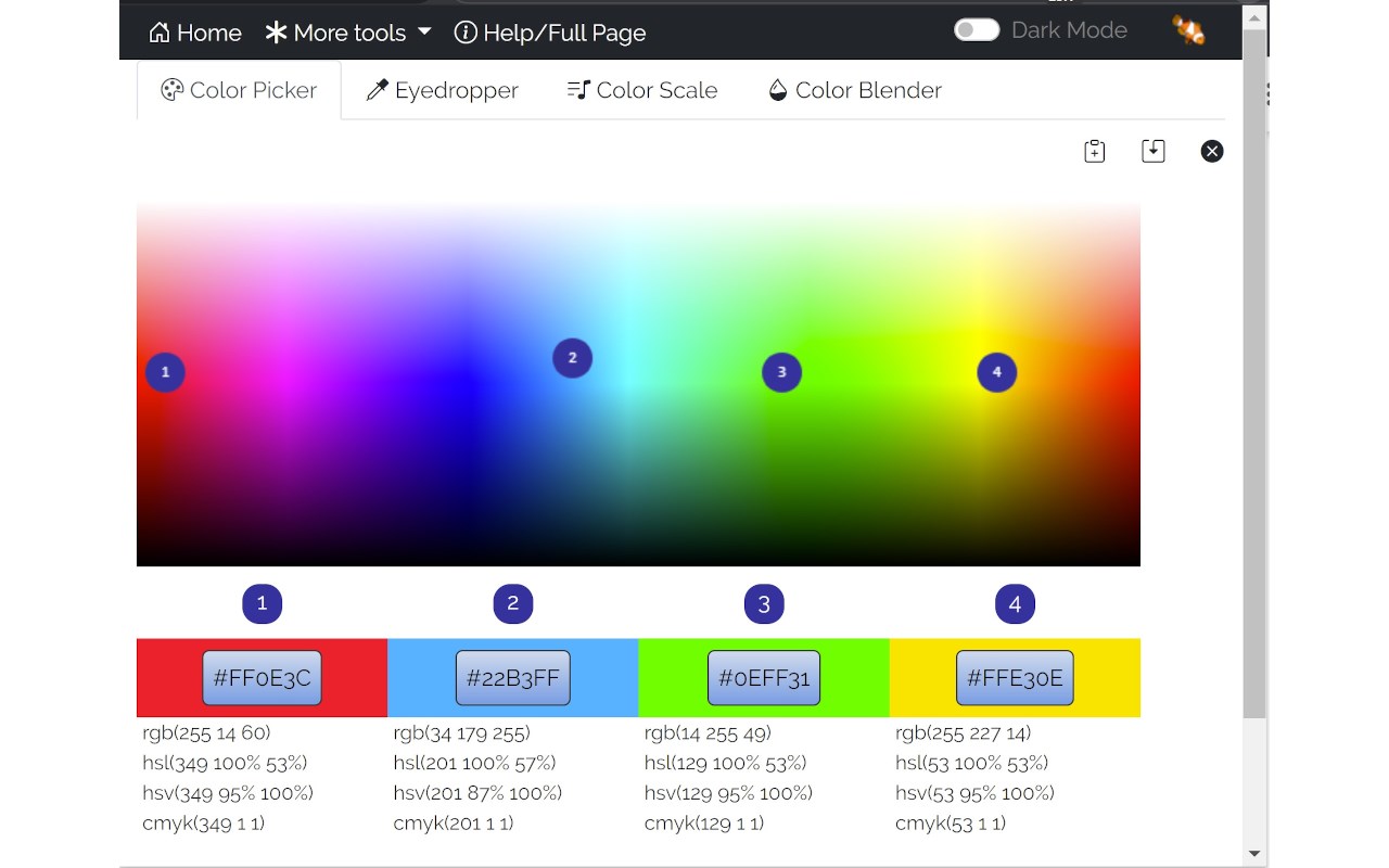
Most art programs use a 2d color picking area with only 1 slider and there are even options to avoid sliders all together like in the google example below:
Now I'm not sure if 0 sliders is optimal, but 3 is too much for me personally.
Anyway the game idea is great and the daily play mode is a nice incentive to come back to the game
howdy! Thanks for the kind words and the feedback, I really appreciate it. I agree, 3 sliders is a bit much! Im thinking something like this on the left will feel better. I’ll get this going in the next update :)
← Return to game
Comments
Log in with itch.io to leave a comment.
It's really fun!! Some feedback:
- I consistently overestimated the brightness of colours, possibly because they flash against a dark background. A more "middle grey" background could maybe help players estimate better.
- it's nice how the sliders fade out while you're not touching them, but I think they could stay very slightly visible. I would often go to tweak the colour very slightly, but I had forgotten where the slider was and messed up my colour.
- the game froze (I think) after I completed the daily. Playing on mobile. Shows "10 of 10 84%" and a big 76% in the centre. Can't press quit.
Still enjoying the game! Another thought: it could be really nice if when the correct colour shows up, it would show the corresponding correct positions for the sliders, as well as where you placed them. You could see for example "oh, I picked a yellow-orange, but it was more of a red-orange."
I think this game could be really great for training colour intuition, and that kind of display could be better feedback than just the numbers.
Great feedback Matt! Thanks a ton for playing, glad you're enjoying :)
Suggestions noted. I really like that idea of showing the target slider locations.
I really like the idea and execution behind this game, well done!
The only issue I have is the controls. 3 sliders takes too long and is too slippery for my liking.
Most art programs use a 2d color picking area with only 1 slider and there are even options to avoid sliders all together like in the google example below:
Now I'm not sure if 0 sliders is optimal, but 3 is too much for me personally.
Anyway the game idea is great and the daily play mode is a nice incentive to come back to the game
howdy! Thanks for the kind words and the feedback, I really appreciate it. I agree, 3 sliders is a bit much! Im thinking something like this on the left will feel better. I’ll get this going in the next update :)
Looks promising, once it's updated I'll check it out for sure!
Updated :) how that feel now?
Feels great, I like it!